Bandito Taqueria 🌮
How do you integrate online ordering for users while meeting Bandito’s business goals? During this project, I was in charge of integrating online ordering for Bandito Taqueria.
Project Overview
Integrate online ordering for Bandito Taqueria while utilizing their existing site.
Role: Product Designer
Duration: 1 week
Company: Bandito Taqueria
Approach
I tackled the project in 3 phases.
Research & Discovery: Competitor Analysis, Stakeholder Interviews, User Interviews
Ideation: Brainstorming, Information Architecture, Persona Development, Sketching
Design: Task Flow, Wireframing, Prototyping, Collaborative Iteration
Research & Discovery
Similar to the last project with Bandito Taqueria, the research process for this project entailed competitor analysis, stakeholder interviews, and user interviews. I began by reaching out to Bandito Taqueria stakeholders, Jesus and Jorge, to understand and outline any business goals, needs, or limitations.
Stakeholder Interviews
After building an online presence with their newly launched website, Bandito Taqueria wanted to capture more sales online by allowing users to place online orders. This being the case, I met with the stakeholders, Jesus and Jorge, to understand their business goals and limitations. Here’s what I gathered utilizing a Venn diagram to annotate findings:
Competitive Analysis
Having gathered some user needs, business goals, and technical constraints, I moved on to researching online to understand what Bandito’s competitors were implementing. This stage also helped develop an understanding of existing methods for online ordering integration. Here are are a handful of sites that I researched:
“I appreciate a fast and seamless online ordering process.”
“I order the same thing all the time from Chipotle, so having my order history available online saves me time.”
During this stage, I kept my research broad from local small-chain restaurants to large successful restaurant chains. By doing this, I distinguished repeating patterns among sites that proved to be successful.
Here are some patterns I recognized:
“Order Online” is typically a standalone CTA button
The CTA button is always above the fold of the landing page
Larger companies tend to have integrated online ordering via the website which keeps the user on the site
Smaller companies tend to have integrated online ordering via a 3rd party vendor such as Clover, which navigates the user off the site to a new window
User Interviews
After performing some secondary research, I opted for some primary research by interviewing a few people as to how they go about online ordering food. Here’s what some users had to say:
“Convenience is key”
“As long as I can customize my order.”
“Seeing pictures of each dish online always helps me decide what I want”
“I love getting updates on the status of my order in real-time so I know when to expect my food!”
Ideation
After the discovery phase, I gathered all the findings and leveraged them to define goals and approaches for the design. The brainstorming phase is done best collaboratively, however being the sole designer on this project, I decided to work closely with the stakeholders and brainstorm with them.
Here are some key activities:
Brainstorm the online order process
Understand who the target users are
Work with limitations to ideate the best user flow
Brainstorming Information Architecture
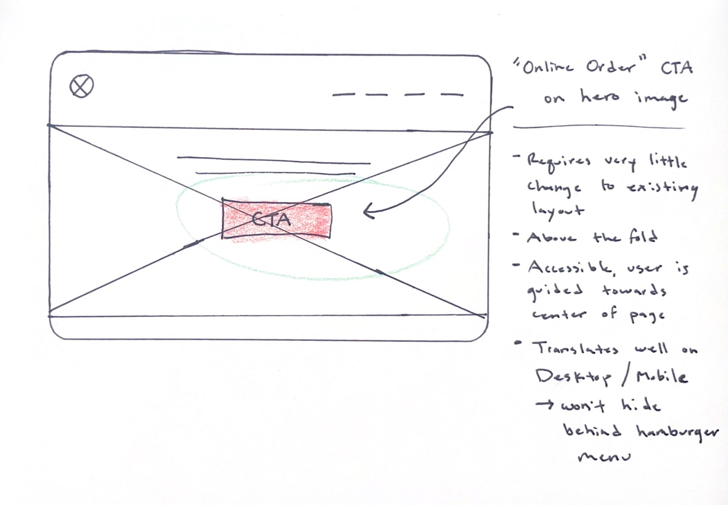
From our research, I found two methods that prioritized online order CTA’s above the fold. The key difference between the two was the placement of the CTA. The first method placed the CTA on the navigation panel and the second method placed the CTA on the hero image or at the center of the screen. Below are some rough sketches with annotations that helped guide my design decisions.
The key finding here was that placing the CTA at the center of the landing page drew more benefits than placing it on the navigation panel.
Benefits of placing the “Order Online” CTA at the center of the page included:
Drawing the user’s attention by being placed in the center
Translating well on both Desktop/Mobile
Being a successful design pattern on restaurant websites.
User Persona
To understand our user, we created a persona to embody Bandito’s target user.
Design
After ideating and cementing some design decisions, I went ahead and implemented the update for the Bandito Taqueria. While it was a brief update, placing an online order CTA at the center of the landing page visually guided visitors to make an online order.
Reflection
This was my second time working with the Bandito team and it was a delightful one that exercised my design thinking. One key thing I learned from this project was to still go through the process of validating design decisions. When I was tasked with this project, I thought I already had the answer but looking closely at secondary research and evaluating design choices, I learned to take it slow and outweigh the pros and cons of each option.
Now, regarding the success of implementing an online order feature to the website, we can only give it time to see if any metrics showcase success. I am glad to have helped a small business reach goals using my design thinking skills. I look forward to the next. ☺️


